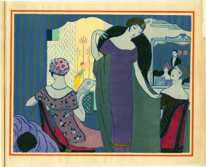
 To ensure these colour are as close to the original, they used a stencilling method called Pochoir.
"....Pochoir, which means stencil in French, had its heyday in the 1910s and 1920s when it was widely adopted by the era’s cutting edge illustrators such as Paul Iribe, Georges Lepape, George Barbier and André Édouard Marty for their illustrations that appeared in ultra-exclusive fashion and lifestyle magazines such as Gazette du Bon Ton, Journal des Dames et des Modes andModes et Manières d’Aujourd’hui. The works that appear in these pages are among the supreme expressions of the pochoir technique, requiring up to 100 separate stencils, in perfect registration with each other, for the colouriste to execute the illustrators’ elaborate compositions. Because of the cost associated with production, the use of pochoirlargely died out in the economic downturn of the early 1930s.
L’Officiel de la Couleur and Cahiers Bleu are two of the few fashion publications that continued to use the technique regardless of expense. Perhaps this is because of the extraordinary range of colors and levels of transparency available with the use of impaste or chemical color mediums; “Impastes were thicker and more solid and number about fifty colors. ‘Chemicals’ were preferred because of their transparency and extraordinary range. More than 1,400 were available.” Compared to the limited-edition fashion publications and artist books of the Teens and Twenties, the use of pochoir in L’Officiel de la Couleur and Cahiers Bleuis relatively simple. Each color appearing on the page indicates the use of a different stencil which was laid upon the page, which had been previously printed with the black lines of the illustration. Brushes, gudgeons or pompons were used to apply the colors, one at a time, to the page. Rarely are do more than three to five colors appear per page, translating to an equal number of stencils, or patrons, required.
The customer-base for this publication was clearly international as it was concurrently published in French, English, Spanish, and Portugese with the promise that readers would be advised “each quarter…on the colors which are to be in vogue in the upcoming season, via this “veritable work of art,” which was “highly sought after by book collectors.”
http://blog.fitnyc.edu/materialmode/2013/12/14/the-color-of-couture/

No comments:
Post a Comment
Pls include your email address if u would like a personal reply to your comment / query. Thanks