This blog was created as a venue for printmakers in Malaysia to come together and share ideas, information and facilities.
We also would like to create awareness, spread the love for printmaking!

Thursday, 8 January 2015

Test Print by Cetak Kolektif


 Tes Print Cover-01

Kuala Lumpur, December 2014 – To wrap up the year 2014, HOM Art Trans is pleased to announce another exciting exhibition that will take place at their gallery in Ampang. Entitled Test Print, this exhibition is a debut showcase of a newly established group of printmakers called Cetak Kolektif.
Cetak Kolektif consists of Samsudin Wahab, Faizal Suhif, Sabihis Pandi, Zul Husni Mohd Ridhuan, Arson Ong and Hazul Bakar who adopt conventional printmaking techniques, such as linocut, woodcut and silkscreen printing, in their art-making. 
 
​ “Printmaking is a medium that has less popularity now compared to other art-making processes like painting, drawing or sculpture,” said Bayu Utomo, director of HOM Art Trans. The aim of this exhibition is to generate interest in printmaking among Malaysian audience, thus elevating the practice of printmaking in the country.
 
Among the main objectives of Cetak Kolektif are to show the society the beauty of printmaking and help other printmakers in Malaysia to bloom and flourish. Besides this exhibition, the collective will also organise many other activities, including a printmaking workshop. Aside from emphasising conventional printmaking techniques, they also attempt to explore printing methods that are less practiced nowadays. This community aims not only to elevate and popularise the art of printmaking among younger generations but also to educate the public about this art medium.
 
Test Print will run from 30 December 2014 until 13 January 2015. There will also be a workshop demonstrating the process of linocut printing on 10 January 2015 at HOM Art Trans. The exhibition’s official launch is slated for 30 December 2014 at 8.30 pm and will be officiated by En. Juhari Said, a well-known Malaysian printmaker. The admission is free and everyone is invited.
 
The gallery is open from Monday to Friday from 11.00 am – 6.00 pm. For more information, please log on to HOM Art Trans website atwww.homarttrans.com
 
Sourced from Daily Seni

Photos during the Exhibition Opening on 30 Dec (sourced from http://www.homarttrans.com/)
Exhibition officiated by Juhari Said, prominent printmaker
  

Also let's view the members of the Cetak Kolektif and their works
ARSON ONG
SABIHIS MD PANDI 
ZUL HUSNI MD DUAN
SAMSUDIN WAHAB
FAIZAL SUHIF
HAZUL BAKAR

Wednesday, 8 October 2014

Letterpress printing

What is Letterpress? 
Letterpress printing has become the go-to printing technique for wedding invitations, greeting cards, and business cards for anyone hoping to make an impression (pun intended) on the recipient.  Today’s cottage industry of letterpress printers has been built on the shoulders of 100 years of printing industry, starting around the late 1800s.  It’s easy to forget that what we treasure today as an artisan product, made by a well-trained craftsperson, was once known simply as printing.
What began with hand-set wood and metal type (read more about this from Jen of Starshaped Press here) has become an industry centered around the photo polymer plate.  Designing for letterpress today begins on a computer, and as such, new fonts, embellished ornaments, graphics, patterns, and complicated multi-color designs can be produced with relative ease.  The printing part is still by hand, one at a time.


Friday, 26 September 2014

Congrats to Long Thien Shih..


Please Note :
Dukacita dimaklumkan bahawa Encik Liao Shiou-Ping terpaksa membatalkan perjalanan beliau ke Malaysia atas sebab yang tidak dapat dielakkan. Manakala Encik Long Thien Shih akan menjayakan demonstrasi seni cetakan tersebut. Harap maklum.

We regret to inform that Mr. Liao Shiou-Ping had to cancel his trip to Malaysia due to unforseen circumstances. The demonstration of print making will be conducted by Mr. Long Thien Shih.

Tuesday, 9 September 2014

How to write an Artist Statement

Many artists have significant problems when it comes to talking or writing about their work, primarily with reference to conceptual matters. Let’s look at a few ways to overcome the challenge of writing a great artist statement.

1, Become a salesperson

Often creators don’t think of themselves as sales-people and forget that the best pitch always comes from the source. And let’s be honest; without concepts and fiscal goals, it is nearly impossible to become a professional artist. Hobbyists don’t need to sell, but if it’s a livelihood, a creator must promote his or her ‘product’. But beware! The sleazy hard-sell doesn’t work very well anywhere nowadays, but it’s even less effective in the art world. People hate to feel they are being pushed into something. The more advantages and benefits you can highlight, the better.

2, The meek don’t inherit

Another situation that can lead to problems in the initial creation of an artist statement is a lack of bravado. There are many shy individuals in the creative world, but this must be suppressed in the discussion of an artist’s work. If you don’t seem confident in your work, it will be much harder for a potential buyer to get excited about it.

3, You do NEED an artist statement

A third type of artist simply doesn’t see the need for the statement; they feel that their work speaks for itself. This can only be the case if you are solely a decorative creator, without a vision or cohesion to these pieces. Otherwise, it always helps to better inform your viewer of your intent. More engagement can only lead to a personal connection, which always produces better sales (and more esteem).

4, Answer questions

When you see others interacting with your work, they have a significant advantage, as you are there to answer questions in a free environment. But most of the time, viewers do not get this opportunity. The artist statement serves as a de facto answer to common questions about your body of work, as a whole or in a series, and it allows for more in depth conversation about your concepts. It can be useful to brainstorm the types of questions you might be asked about your work as a way to start writing your statement.

5, Don’t baffle your audience with jargon

A common misconception about the artist statement is that it must be written in International Art English, that jumbled mess of lofty jargon used in press releases and criticism books (I have written more about thishere). This is not the case, and an overly ostentatious statement can lead the viewer to be more confused at your work than before. Leave that language to critics, bloggers, and academics. You don’t want to limit your audience.

6, Don’t bore your audience with drawn out copy

An artist statement doesn’t need to be very long. If you lose the reader’s concentration, the writing is of little use. Optimally, the piece should be no more than 20 total sentences, broken up into 3 or four paragraphs. The first paragraph can be about why you make your art, and then delve into why you create in the medium. Once again, be clear and concise. This is an essential introduction to your work.

7, Be yourself

Be sure to write from your point of view. There is a reason it is called an artist statement. It is from you to new viewers. There’s no need to give them your whole life story; think of this as a movie trailer to your entire body of work. Draw viewers in.

8, Consider getting help

If you aren’t the most confident writer, don’t worry. You can hone this over time, or if you wish to outsource, there are many resources online (Like Elance) in order to reach out to hungry art writers. Art writers are out there, always looking for this type of work. They should be able to handle your project with ease, in a timely manner. This could save an uninitiated writer some time and worry, and could also serve as a foundation for a future statement. As your goals and concepts develop, simply adjust those aspects of the piece.

9, Don’t show off

It is also best to avoid using any self-congratulatory language in your piece. This is like a movie trailer, not a movie poster. If Roger Ebert gave you two thumbs up, it is of no importance. You are laying the groundwork for interest, and testimonials can turn viewers off. Also, artists want their work to speak for itself, so why would you want to give up your space so someone else can talk about your art?

10, Join the dots and tailor-make your statement

The most important aspect in describing your work is to show the connection between the concept (what you’re saying) to the physical structure. In the textile world, as with many others, this can be the most difficult aspect of the statement. Try to pick out a few examples to engage the viewer. If the fabric or weave evokes certain cultural topics, state them. Even for the most experienced viewer, these nuances can easily be lost without explanation. It isn’t a fault of the artist; those details are what created your individuality. To lose those is to lose it all.
Galleries may ask for specifically tailored statements to engage for their shows. Depending on the show, especially in group shows, this may be written by the gallery itself. Their job is to show correlation between all of the involved artists, and might focus on only one aspect of your work.
If you are asked to craft and artist statement yourself for a solo show, you need to show the relation between your works to each other, the show, and the space itself. Describe how these pieces fit together, with no more than one sentence relating to work outside the show. Optimally, only the work in the show should be referenced; write about outside work only if it differs from that in the show significantly.
The title of the show is so essential, yet rarely truly accurate. Critics and viewers respond to a title, so if you can relate your works to the show in an understandable way, the show will be heads above others. In that vein, it helps to expound a bit on the reason you chose that space for your show. Viewers can decipher if you simply picked the gallery because they had space, so make sure they know it was a merger that made sense for both parties.

A well-written artist statement can help cultivate an informed audience and one that is intrigued by your work. It’s a good idea to constantly revisit yours to ensure it appropriately represents you as you now!

Friday, 14 March 2014

‘STORIES FROM THE SOIL’ - Solo Exhibition by Faizal Suhif

Faizal Suhif, born 1984 graduated from UiTM with his Master degree in Fine Art last year is having a solo exhibition entitled Stories From The Soil at the G13 Gallery from 1st March to 22nd March 2014. Exhibiting 25 pieces of new works including oil paintings and transfer printings, the artist will also complete the exhibition by installing nature elements to enhance the visual communication.

Spending plenty of time while making art and has developed from the conventional printmaking, Faizal invented his very own printmaking skills to create artworks. “I like to wander around my living area with my tool kit, whenever I see interesting texture, the ground the cement, I will start doing the transfer print", said Faizal during an interview. To him the time consumed is not merely a process of art making but also a conversation with the nature and meditation to the artist himself.

Growing up from a farming family, Faizal's concern is about Mother Nature and he believes in the effort of seeding. "Seeds can grow into trees, they are the food and oxygen supplier, but people don't normally appreciate seeds", Faizal finds people often running after velocity and achievements but neglected the basic elements that breed us, he hopes his artworks can ease the pace and calm the soul, at the same moment convey his theory to the audiences.

‘STORIES FROM THE SOIL’ - Solo Exhibition by Faizal Suhif
Opening Reception                : 8pm, Saturday , 1st March 2014

To be officiated by 
        :  Mr.Juhari Said

Exhibition period                         : 1st March – 22nd March 2014
Gallery opening  hour                  : Monday - Sunday, 11am – 5pm (Closed on Public Holiday)
Venue                                         : G13 Gallery, GL13,Ground Floor, Block B, Kelana Square, 
     Jalan SS7/26, 47301 Kelana Jaya, Selangor. (behind Paradigm Mall)

Email                                          : info@g13gallery.comFacebook                                    : www.facebook.com/G13gallery


To view the latest updates of the artworks availability, log to: http://g13faizalsuhif2014.blogspot.comTo view more about the exhibition, log on to : www.g13gallery.com

For all inquiries please contact :
G13 Gallery
Tel: 03-7880 0991 / 012-211 4697 (Kenny Teng)

Wednesday, 8 January 2014

Painting & Printingmaking Exhibition in Bali

Foreign/er - Painting and Printmaker Exhibition


Artists   :   AmmarinKuntawong (Arm) and Christopher Stern
Opening Ceremony : January, 18, 2014
Duration                : January, 18 until January 31. 2014
Venue                   :  Paros Gallery , Jalan Pantai Purnama Banjar Palak Sukawati Gianyar Bali
P.   0361-298120. 

E.   parosart@yahoo.com

What does it mean to be a foreigner? Who determines what is foreign, and how different is the foreign from the local? This exhibition features works by two foreigners – one, a Westerner, fluent in Indonesian, and knowledgeable about many aspects both Balinese arts and culture, and the other, an Asian, but with no experience of Indonesia aside from the friendship of two Balinese artists. Each artist works in a completely different style to the other, and utilizes different media and techniques. But whose work will appear more ‘foreign’, or rather, foreign-er, to Indonesians?


AmmarinKuntawong (Arm) is a printmaker and professionally trained artist. While Arm is expert in many different styles of printmaking, his technique of choice is hard ground etching. He produces dreamlike landscapes, entirely devoid of figures, yet somehow extremely alive. His work evokes feelings of the ancient Lanna kingdom, today the northwest region of Thailand, from which he comes.


Christopher Stern has no formal arts education, but has enjoyed sketching and designing for most of his life. With a background in Industrial Design, Chris came to Bali in 1998. In 1999 he opened galeri sembilan in Lodtunduh, Ubud, and through this experience became familiar with the work of a great many Balinese artists. He began painting full-time one year ago. Although still exploring style and subject matter, most of the work for this show consists of solitary figures of unusual attitude and demeanor.


Perhaps the only thread that ties the work of these two artists together, aside from their ‘foreign’-ness, is a degree of introspection and an uncanny access to unconscious thoughts and feelings. Both artists, Arm, through landscape, and Chris, through figures, present interior worlds which it is hoped will resonate at some deep level with the public. 

Sunday, 29 December 2013

Spot Art 2013 - Chua Shu Ruei

In the recently concluded Singapore Biennale 2013, there was a parallel event called Spot Art 2013.

SPOT ART is a high quality, juried art festival for art students and artists under 30 in Asia that aims to strengthen relationships between artists, art institutions and arts professionals in Southeast Asia. Our event will take root as a dynamic and meaningful event for the art world, as well as for the general public, where young artists can mingle with an international audience of art professionals, art collectors, peers and tourists. SPOT ART is an opportunity not only for artists to be seen and heard, but also for the audience to reflect on their creativity as a sign of our times. It is a time to look and listen to what they are saying, reach out to them as they do to us and offer our support and encouragement as they work tirelessly to enrich and advance our cultural heritage. SPOT ART is a new and innovative addition to the burgeoning art infrastructure in Singapore. 

Congrats to Chua Shu Ruei from ASWARA,  the only Malaysian entry selected under a rigourous process by a 7-person selection committee.

Two of her 'Manusia' series artworks were selected for the exhibition : Orang Boxes 2 and Orang Boxes 3


Orang Boxes 2
Orang Boxes 3
They are print installations that combine extended and alternative printmaking with light boxes. She uses digital print and ready made/industrial prints.

Look familiar? Aren't those orange boxes we see so much during Chinese New Year? Just how does Shu Ruei conceptualise her work?

She credits it mainly to her Fine Art training at ASWARA where they were encouraged to incorporate local traditional heritage culture into contemporary art. "This is as a way to preserve and evolve the significance of traditional culture so that it can continue to be relevant within a contemporary context", Shu Ruei explains.

The Manusia series is her Diploma graduation project at ASWARA. In her final semester, she majored in Printmaking and minored in Sculpture.

We first met Shu Ruei when she accompanied ACG members and Art Malaysia's Editor-in-Chief, Liew Kean Yap on a short visit to her lecturer, Juhari Said's Akal Di-Ulu (studio / home / farm).

She is a soft-spoken and a dedicated artist. Imagine, in her research of our Malaysian Chinese Lion Dance, she followed a local lion dance company (Wan Seng Hang Dragon and Lion Arts) for over 2 and a half years. She frequently visited their workshop to observe their materials and techniques. She also followed and documented them during performances and practice sessions.

And then incorporated this research into the Manusia series which deals with the issues of dehumanisation, identity and self-categorisation.

http://www.shuruei.weebly.com 

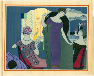
Flashback: POCHOIR - stenciling technique

Speaking of Haute Couture (high fashion), in the 1950s, top fashion houses like Balenciaga & Dior would print magazines for their clients showing their latest designs in full colour and with fabric swatches.

To ensure these colour are as close to the original, they used a stencilling method called Pochoir.

"....Pochoir, which means stencil in French, had its heyday in the 1910s and 1920s when it was widely adopted by the era’s cutting edge illustrators such as Paul Iribe, Georges Lepape, George Barbier and André Édouard Marty for their illustrations that appeared in ultra-exclusive fashion and lifestyle magazines such as Gazette du Bon Ton, Journal des Dames et des Modes andModes et Manières d’Aujourd’hui. The works that appear in these pages are among the supreme expressions of the pochoir technique, requiring up to 100 separate stencils, in perfect registration with each other, for the colouriste to execute the illustrators’ elaborate compositions.  Because of the cost associated with production, the use of pochoirlargely died out in the economic downturn of the early 1930s.

L’Officiel de la Couleur and Cahiers Bleu are two of the few fashion publications that continued to use the technique regardless of expense.  Perhaps this is because of the extraordinary range of colors and levels of transparency available with the use of impaste or chemical color mediums; “Impastes were thicker and more solid and number about fifty colors. ‘Chemicals’ were preferred because of their transparency and extraordinary range.  More than 1,400 were available.”  Compared to the limited-edition fashion publications and artist books of the Teens and Twenties, the use of pochoir in L’Officiel de la Couleur and Cahiers Bleuis relatively simple.  Each color appearing on the page indicates the use of a different stencil which was laid upon the page, which had been previously printed with the black lines of the illustration.  Brushes, gudgeons or pompons were used to apply the colors, one at a time, to the page.  Rarely are do more than three to five colors appear per page, translating to an equal number of stencils, or patrons, required.
The customer-base for this publication was clearly international as it was concurrently published in French, English, Spanish, and Portugese with the promise that readers would be advised “each quarter…on the colors which are to be in vogue in the upcoming season, via this “veritable work of art,” which was “highly sought after by book collectors.”
http://blog.fitnyc.edu/materialmode/2013/12/14/the-color-of-couture/

Friday, 6 December 2013

The Flyway Print Exchange - an update

In June 2013, we received an invitation (call for entries) to join a printmaking exchange initiative related to shorebirds conservation.

Here's a Facebook page for those interested to follow development of this event..
https://www.facebook.com/pages/The-Flyway-Print-Exchange/175252916007801

The Flyway Print Exchange is an art project that links 20 artists from 9 different countries along the East-Asian Australasian Flyway.
Description
The Flyway Print Exchange is an exchange between artists living in different countries along the East-Asian Australasian Flyway, the flight path travelled by Australia’s migratory shorebirds twice annually between their breeding and non-breeding grounds.

Twenty artists, from nine of the twenty-two Flyway countries, will create prints inspired by the idea of the Flyway. One print from each edition will then be posted, unprotected, along the Flyway and back, echoing the birds’ journey, adding the impression of migration and distance to the works and referencing the weathering of the migrating birds’ plumage. The prints, weathered and pristine, will be exhibited together in Melbourne in 2014.
....The Artists
The twenty artists who are participating in the Flyway Print Exchange range from recent graduates and emerging artists, to academics and established artists of long standing. The artists and the countries they represent are:
Australia: Alexis Beckett; Kate Gorringe-Smith; Helen Kocis Edwards; Amanda O’Sullivan; Vida Pearson;
three indigenous artists (to be confirmed) from Waralungku Arts
New Zealand: Celia Walker
Indonesia: Syahrizal Pahlevi
Singapore: Tham Pui San
India: Radhika Gupta; Kavita Shah
South Korea: Hyun Tae Lee
Japan: Kyoko Imazu
China: Cui Xiao Hua; Ni Jianming; Feng Jiaming
USA (Alaska): Garry Kaulitz; Edwin Mighell

View websites of the event and some of the artists, to view their works ..

Friday, 30 August 2013

Calling all Malaysian Print Artists


Calling all print artists .... 
come join 1001 Malaysian Artists & Sculptors exhibition 
25 Sept - 29 Sept 2013 @Viva Homes - Exhibition Hall, Kuala Lumpur.

and also be on the E-DIRECTORY
The nation's largest artists' convergence, all-in-one massive online e-Directory. 
to see a preview of the e-directory http://artmalaysiagroup.com/artist/listing

All Malaysian artists and sculptors are encourage to send in your info to : info@artmalaysiagroup.com 
or call Art malaysia office 03-9281 6868 (office hours)

AS SOON AS POSSIBLE! THERE'S STILL TIME

Saturday, 3 August 2013

ASWARA - Graduation exhibition (visual arts) 2013

From 19 June 2013 to 2nd of July, the graduating class of 2013, Art Dept at Aswara had their graduation exhibition.  Among them were some interesting printmaking artwork, either explicitly print or a mix with other media.

I was invited to view the exhibits by Ms Chuah Shu Ruei, part of the organising committee but was not able to attend. However, she was kind enough to roundup some pretty amazing print works by the graduates for our viewing pleasure.

It's always interesting and inspiring to view works by new, aspiring artists!!

Ean Siew Yieen 
- Majored in Printmaking
Ean Siew Yieen- 'Traditional Life II'- Stencil print, acrylic
- Theme: Lotus
- Ean Siew Yieen perceives the lotus beyond it's usual Buddhistic connotations, and instead explores its role in traditional health foods and medicine.

Aizat Amir bin Ahmad Sanusi 
- Minor in Printmaking
Aizat Amir- 'Saya Budak Baru Belajar'; Mixed media- Silkscreen, oil paint, collage, lacquer
- Theme: Pantun Melayu
- Aizat's installation piece based on the pantun 'Buah Cempedak Diluar Pagar' invites the viewer to reminisce on old school days, and to realize how we are still and always pupils to our everyday environment.

Anith Fatin binti Hafidzi
- Majored in Printmaking
Anith Fatin- 'Songket Bunga Melur (Jasmine)'; Silkscreen printing, glass, Stainkis
- Theme: Songket Motif
- Anith Fatin incorporates songket motifs into her work to rekindle and deepen the viewers awareness and understanding of this traditional craft; it's elegance, history, and     great cultural value.

Muhamad Hazul bin Abu Bakar
- Minor in Printmaking
Hazul Bakar- 'Kill By Money'; Silkscreen printing, Bitumen, ink on canvas
- Theme: Before and After
- This series is based on the Hadith 'Lima Perkara Sebelum Datangnya Lima Perkara' and on the artist's thoughts and observations of contemporary society. His work mulls on a society lost and negligent of their religious duties, and the consequences of this.

Abdul Aziz bin Mohd Suhaimi (Suhaiziz)
- Minor in Printmaking
Suhaiziz- 'Rhythm of Champions' - silkscreen printing
- Theme: Rhythm
- Through his series, Suhaiziz ponders, distorts and explores the world of Wayang Kulit music and instruments.

Chuah Shu Ruei 
- Majored in Printmaking
'Orang Boxes'_ Digital Print, light box, ready made objects
- Theme: Dehumanisation 

- 'Orang Boxes' is a Manglish play of words, where a small typo in 'orange boxes' changes its meaning to 'people boxes'. Mandarin orange boxes are a metaphor for how        assigning identity to ourselves and stereotyping is a way of packaging/objectifying/dehumanising ourselves and each other. 

Saturday, 6 July 2013

A Town Called George

Paris-based artist, Marie Dargent, gives George Town a new tinge, hue and perspective through a complex series of processes that includes the ancient method of hand-printing on a stone lithographic press. The colours, composition and use of collage and photography recaptures Dargent’s transient emotions of George Town, in the same esprit as her series covering the cities of Istanbul, Venice, Paris and Kuala Lumpur. Dargent and her husband, photographer John Brunton were in Malaysia last year for an architectural heritage exhibition using the same technique.
For more info: www.mariedargent.com
Date: 7 June - 7 July 2013

Time:Hotel hours
Venue:Victory Annexe Lobby, E&O Hotel, Georgetown, Penang.
Admission: Free

From FB  post :   Art 101: Lithography
Meet artist Marie Dargent in Victory Annexe, E&O Hotel today and tomorrow (6 & 7 JULY 2013) to learn the process of lithography, which is used for her collection of A Town Called George. Catch her from 2pm to 5pm on both days.
More info: http://georgetownfestival.com/free/a-town-called-george

Wednesday, 19 June 2013

Flyway Print Exchange.

Received this last week.  Malaysian printmakers, do contact them directly if you are interested.

Call for Artists : Flyway Print Exchange.
A Melbourne-based project seeking to unite artists along the East-Asian Australasian Flyway and promote shorebird conservation.

I am currently, with the endorsement BirdLife Australia, initiating a print exchange around the idea of the East Asian-Australasian Flyway. Participating artists will be asked to create a print in response to the stories of Australia’s migratory shorebirds, then to create an edition with three purposes. Firstly, every artist will receive one of each print. Secondly, additional copies will be available for exhibition and sale. Thirdly, I will post one print from each edition, unprotected, along the flyway and back, to then exhibit alongside its pristine counterpart. If they find their way home, the prints will be weathered by the journey. If they don’t, that too will be significant.
  
I am looking for a representative artist from as many Flyway countries as possible (these are: the USA [Alaska]; Russia [Siberia]; Mongolia; China; North Korea; South Korea; Japan; the Philippines; Vietnam; Laos; Thailand; Cambodia; Myanmar; Bangladesh; India; Malaysia; Singapore; Brunei; Indonesia; Timor; Papua New Guinea and New Zealand). After an initial exhibition in Melbourne I hope to travel the exhibition to some of the countries of the other participating artists.

If you would like more information, or if you know any artists living in flyway countries who might like to be involved, I would love to hear from you.

Kate Gorringe-Smith


******************************************************************************
The Flyway Print Exchange – Introduction 

The Flyway Print Exchange is an exchange between artists living in various countries along the East-Asian Australasian Flyway, the flight path travelled by Australia’s migratory shorebirds twice annually between their breeding and non-breeding grounds.

Aims
-          To bring together artists from a wide variety of cultural and artistic backgrounds
-          To publicise the age-old linking of our countries through the natural phenomenon of bird migration
-          To raise awareness of migratory shorebirds.

The Flyway
Artists are invited to investigate the idea of the Flyway and to use it as the starting point for their work.

The annual departure and arrival of migratory birds is a spectacle which has symbolic meaning in numerous cultures around the world. Many of these birds travel vast distances, crossing several countries and entire continents during their annual cycle of migration.

The countries that comprise the East-Asian Australasian Flyway are: the USA (Alaska); Russia (Siberia); Mongolia; China; North Korea; South Korea; Japan; the Philippines; Vietnam; Laos; Thailand; Cambodia; Myanmar; Bangladesh; India; Malaysia; Singapore; Brunei; Indonesia; Timor; Papua New Guinea; Australia and New Zealand.

The Prints
Artists will be invited to create a limited edition of a print produced in response to the idea of the flyway and the bird species that frequent it. Finished editions will be posted to the project co-ordinator in Melbourne, Australia.  The dimensions of the print will also be specified, and paper and postage will be provided.

- Each artists will receive one of each print in the exchange.

- Two prints from each edition will be posted, with no protective cover, along the Flyway to Alaska and back to Australia to mirror the journey undertaken by the birds. The weathered print will then be exhibited, alongside its pristine counterpart. The weathered print will refer to the physical reality of the birds’ journey.

- The remaining prints (as many as the artist wants to print in addition to those produced for the above purposes) will be offered for sale.

A proportion of the money from sales will be donated to BirdLife Australia to the Shorebirds 2020 Project which is working to conserve migratory shorebirds. BirdLife Australia would also have limited reproduction rights of the Exchange images for both publicity and revenue purposes.

Exhibitions
The prints from the exchange, both weathered and pristine, will first be exhibited in Melbourne, Australia. The exhibition will be publicised throughout the membership of BirdLife Australia, as well as through Australian art media.

Our aim is then to seek galleries along the Flyway to subsequently exhibit in the countries of each participating artist. We would ask participating artists for their input as to appropriate venues for the exhibition. 

Approximate Timing
September 2013:  Participating Artists finalised
March 2014:  Editions completed and posted to the co-ordinator
June 2014: ‘Flyway’ prints return from posting along the Flyway and back
September 2014: First exhibition of the Flyway Exchange in Melbourne, Australia 

This document is a preliminary draft of the details of the exchange. Artists’ who express an interest in participating will be sent the final conditions of entry, a registration form and more specific details of the Flyway and the species that traverse it. 

Please send expressions of interest to:

Kate Gorringe-Smith
Flyway Print Exchange Co-ordinator
Mobile: 0432 322 408
Website: www.kategorringesmith.com.au     

Related Posts Plugin for WordPress, Blogger...